Jul 12, 2024
Creating Responsive Design Portfolio
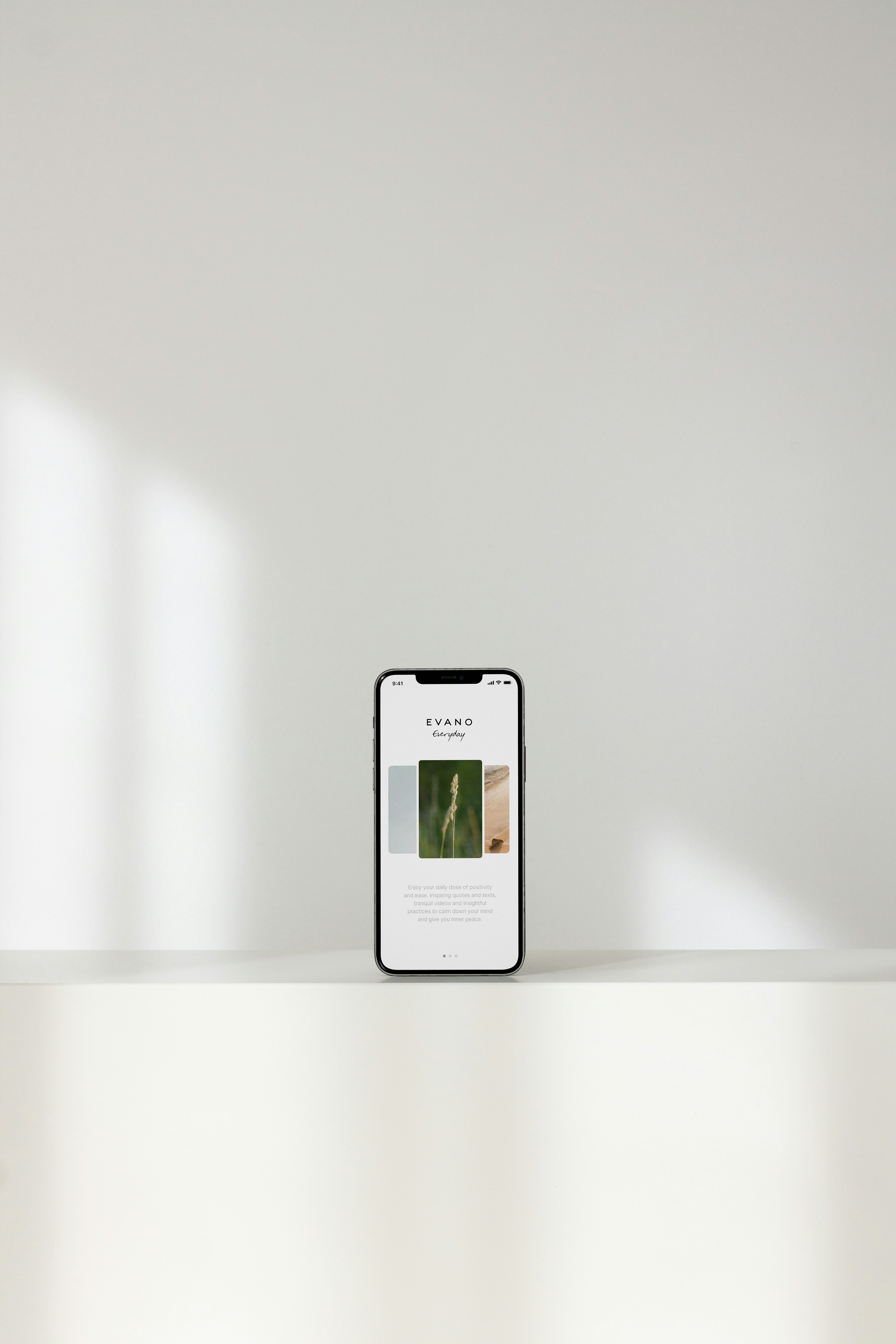
In today’s mobile-first world, having a responsive portfolio is not just a luxury—it’s a necessity. Whether someone is viewing your work on a smartphone during a commute or on a desktop in the office, your portfolio needs to look polished and function seamlessly.
Here’s how to ensure your portfolio is responsive:
Flexible grids and layouts: Your layout should adapt fluidly to different screen sizes. A grid system ensures that content remains structured and readable across devices.
Mobile-first approach: Start by designing for smaller screens, then scale up. This ensures the most crucial information remains accessible, no matter the device.
Touch-friendly elements: On mobile devices, make sure buttons and interactions are easy to tap, with ample space between elements.
The template is designed with responsiveness in mind, ensuring that your portfolio remains beautiful and functional on every screen, from smartphones to large desktops.


